A design system is the shared language a product team uses to build consistently: the colours, type, spacing and components, the rules for using them, and the code that makes those rules real. For a product with three screens it is overkill. For a product with thirty screens, two platforms and a team that has grown past the point where everyone sits in one room, it is the difference between shipping quickly and spending every sprint reconciling four slightly different buttons. This guide covers what a design system is made of, when a growing product needs one, how to build it without stalling delivery, and how to keep it alive once it exists.
What a design system actually is
A design system is not a style guide, a Figma file or a component library, although it includes all three. It is the combination of design tokens (the raw values — colours, type scales, spacing units, radii, shadows), components (buttons, inputs, cards, navigation, built once in design and once in code from those tokens), patterns (how components combine to solve recurring problems such as forms, empty states, tables and dialogs), and documentation (when to use each thing, and when not to).

The crucial property is that the design and the code describe the same thing. A button in Figma and a button in the codebase share a name, a set of variants and a set of tokens. Change the primary colour token and it changes everywhere, in both. Without that link, a "design system" is two separate systems that drift apart within a quarter.
The signs that you need one
Teams rarely decide to build a design system on principle. They build one because the cost of not having one has become visible:
- The same component exists in several versions, each built by a different engineer for a different screen
- Designers spend more time redrawing existing elements than designing new flows
- A small brand change — a new colour, a new font — takes weeks and touches hundreds of files
- New hires cannot tell which of the five card styles is the current one
- Accessibility fixes have to be applied screen by screen because there is no shared component to fix once
- Mobile and web look like products from different companies
If two or three of these are true, the system will pay for itself in the first year. If none are, keep shipping and revisit when the team grows.
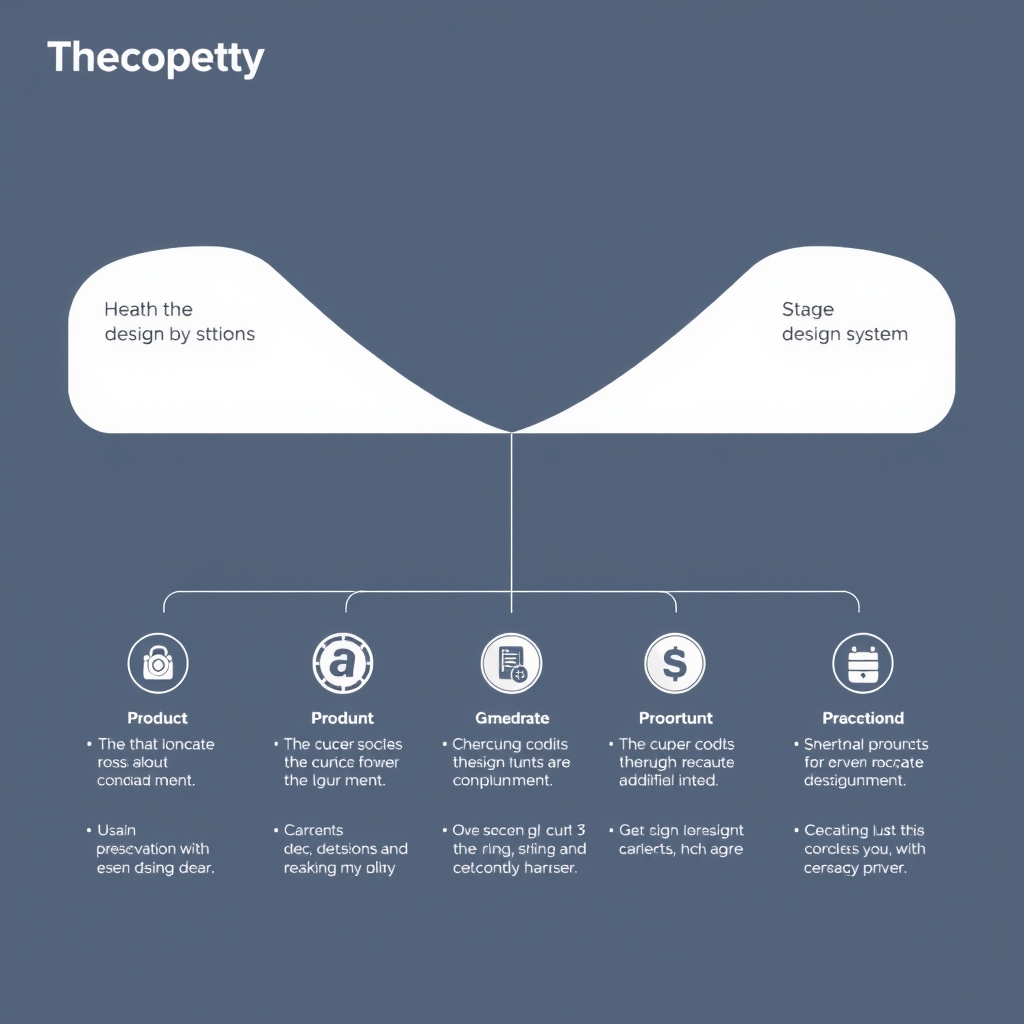
Key components of a design system
- Design principles. A short set of statements that resolve arguments — "clarity over density", "one primary action per screen". They are only useful if they are specific enough to reject something.
- Tokens. Named values that every component references. Colour roles rather than hex codes (surface, text-secondary, border-strong), a type scale, a spacing scale, elevation levels. Tokens are what make themes, dark mode and rebrands tractable.
- Component library. The buttons, inputs, selects, cards, modals, tabs, tables and navigation, each with defined variants, states and accessibility behaviour, built in code and mirrored in the design tool.
- Design patterns. Reusable solutions to common problems — form layout and validation, loading and empty states, destructive confirmations, onboarding — assembled from components.
- Documentation. Usage guidance, do-and-don't examples, and the reasoning. A component without documentation is a component that will be misused.
How to build one without stopping the product
The most common failure is the big-bang design system: a team disappears for a quarter to build every component in the abstract, and returns with a library that does not fit the screens the product actually has. The alternative is to extract rather than invent.
Start by auditing what exists. Screenshot every screen, group the elements, and count the variants — this exercise alone usually reveals a dozen buttons that should be three. Define the tokens first, because everything else depends on them, and apply them to the existing codebase so the current product starts using named values instead of magic numbers. Then build components in order of frequency: the ones used on the most screens first, each one replacing its ad-hoc predecessors as it lands. Ship the system incrementally, inside real features, so it is tested against real needs from the first week.
- Audit the current product and count the variants of everything
- Define tokens and migrate the codebase to them before building components
- Build components by frequency of use, replacing existing ones as you go
- Keep design and code in lockstep — one name, one set of variants, one source of truth for tokens
- Document each component when it ships, not "later"
Accessibility belongs in the system, not the screen
A design system is the most effective accessibility investment a product can make, because fixing a component once fixes it everywhere. Colour contrast is enforced at the token level. Focus states, keyboard handling, ARIA attributes and touch target sizes are built into each component and inherited by every screen that uses it. A team that has this in place gets accessible interfaces by default; a team that does not has to remember, screen by screen, and will not.
Governance: who owns it and how it changes
A design system that nobody owns decays. Someone — a small core group, or one designer and one engineer with dedicated time — has to be responsible for it: reviewing contributions, deciding when a one-off becomes a component, deprecating what is no longer used, and publishing releases with clear notes. The process for proposing a change should be lightweight and public, so product teams contribute rather than route around the system.
Version it like any other dependency. Product teams should be able to upgrade on their own schedule, with breaking changes called out and a migration path documented. A system that forces every team to update at once will be pinned to an old version forever.

Multi-platform: one system, several renderers
A product that ships on web, iOS and Android has to decide how far the system reaches. The tokens should be shared completely — one source file, exported to CSS variables, Swift constants and Kotlin resources by a build step, so a colour change lands on every platform in the same release. Components are a different matter. A web button and a native iOS button should look like siblings, not clones; each platform has conventions its users expect, and a system that ignores them produces interfaces that feel foreign. The practical rule is shared tokens, shared naming and shared documentation, with components implemented per platform against the same specification. Cross-platform frameworks such as React Native or Flutter simplify this by letting one component implementation serve both mobile platforms, at the cost of some platform-specific feel.
Common mistakes
- Building it in isolation. Components designed without a real screen to live on will not fit the real screens.
- Too many variants. A button with fourteen sizes and nine colours is not a system; it is a menu. Constraint is the point.
- Documenting nothing. A library without usage guidance is reinvented by every team that touches it.
- No owner. Without someone accountable, the system freezes at the version it was launched with.
- Treating it as finished. The product will keep changing; the system has to keep pace or be abandoned.
Measuring whether it is working
The metrics that matter are practical. How much of the product is built from system components rather than one-offs — adoption should climb toward the high nineties and stay there. How long a new screen takes to build compared with before. How long a brand or token change takes to roll out. How many accessibility issues are reported per release. And the qualitative one: whether designers and engineers describe the system as something that helps them or something they have to work around. If it is the latter, the system is being built for its maintainers rather than its users, and the priorities need to change.
Frequently asked questions
When is a product too small for a design system?
If one designer and a couple of engineers can hold the whole product in their heads and ship consistently without one, you do not need it yet. Define tokens early anyway — it costs almost nothing and makes the eventual system far easier to introduce.
Should we build our own or adopt an open-source one?
Adopt an established component library as the foundation and theme it with your tokens, unless your product's visual identity is a core differentiator. Building every component from scratch is expensive, and the accessibility work alone takes months to do well. Most teams are better served customising something proven.
How long does it take to set up?
Tokens and the first ten or so core components can be in production within a couple of months when extracted from an existing product. Full coverage takes longer and never truly finishes — a design system is maintained, not completed.
Inverge Tech builds design systems for growing products, from the token architecture to the component code on web and mobile. If your product has reached the point where consistency is costing you speed, we can help you build the system that gets both back.